
Struggling with how to design a professional-looking UI? This article is a complete guide, equipping you with the knowledge to craft user interfaces that are not just visually appealing, but also strategic and functional.
The importance of good UI design should not be overlooked, as 94% of first impressions are design-related. This means that having attractive, well-crafted visuals can make or break a brand, making UI designers quintessential aspects of positive brand recognition.
Whether you’re a beginner or a seasoned designer, we’ve got some insights you’re looking for. Get ready to dive into fundamentals, apply design principles, navigate patterns, and employ advanced techniques.
Key Takeaways
Balancing Creativity and Usability: A successful UI design requires a delicate balance between creativity and usability. Prioritizing aesthetics alone may compromise user experience, emphasizing the importance of creating interfaces that are visually engaging while remaining intuitive and functional.
Iterative Process and Continuous Improvement: UI design is not a one-time task but an ongoing, iterative process. Designers should embrace continuous learning and refinement, incorporating user feedback to enhance accessibility, usability, and overall user experience. Each iteration contributes to the evolution of a design that best meets user needs.
Accessibility and Device Optimization: Accessibility is a fundamental requirement in UI design, ensuring inclusivity for all users, including those with disabilities. Additionally, optimizing designs for different devices through responsive design is crucial, providing a consistent and enjoyable user experience across various screen sizes and orientations.
UI Design Fundamentals
A well-designed user interface is very similar to a well-structured building, it is built on solid fundamentals.
It’s not about flashy graphics or trendy design elements. It’s about creating a seamless interaction between users and digital products. The UI serves as a point of contact, a pathway that guides users through the digital landscape.
Yet, the creativity of a UI designer is closely connected to the necessity of usability. After all, a user interface that is hard to navigate, no matter how aesthetically pleasing, defeats its purpose.
It’s like a beautifully designed building with a maze-like layout – it may be visually appealing, but if people can’t find their way around, they’ll get lost, frustrated, and leave. Thus, a fine balance between creativity and usability is crucial in UI design.
What is UI Design?
UI design, short for user interface design, is the practice of creating visually pleasing and user-friendly digital interfaces. This process enhances the interaction between users and digital products, such as websites and apps, making them more engaging and intuitive to use.
In other words, it’s the space where interaction between humans and machines occurs. It’s the:
Buttons you click
Text you read
Images you see
And everything else that makes up digital interfaces. It’s what makes a digital product accessible and usable.
Comprehending user needs holds critical importance in UI design. It’s about walking in the user’s shoes, seeing from their perspective, and empathizing with their challenges. After all, a well-designed user interface is not just visually appealing, it’s also functional, intuitive, and user-centered.
It’s about creating an interface that adapts to the user, not the other way around.
The Role of a UI Designer
Think of a UI designer almost like an architect but for the digital realm. Their job is to enhance user satisfaction by improving the visuals, usability, accessibility, and pleasure provided in the interaction with the product.
They’re the ones who ensure that your journey through the digital landscape is smooth and enjoyable.
A UI designer assumes many roles. Their understanding should encompass UI design skills such as:
Color theory
Typography
Layout
Interaction design
Interface design
Graphic design
And more.
UI Design Elements
UI design elements are the building blocks of a user interface. These elements, when used effectively, can create an interface that is both visually appealing and user-friendly. Here’s an in-depth look at some of the most common elements and best practices for implementing them.
White Space
White space, or negative space, is the area between design elements. It’s not necessarily white; it’s simply unmarked space. White space gives your design breathing room, reducing cognitive overload and improving readability.
When white space is not properly implemented, it can result in cluttered and hard to navigate screens.

When white space is taken into consideration, the readability of the screen significantly improves.
It acts as a visual pause, giving your design elements room to breathe and helping to highlight key points. It’s a crucial element that can significantly improve readability and overall user engagement.

How to Implement White Space
The best way to professionally implement white space is by using a “non-linear spacing system.
A non-linear spacing system in UI design is a method of implementing white space where the spacing increments are not consistent or equal. Instead, they grow at an increasing rate.
This approach allows for more fine-tuned control over the layout at smaller scales while still providing ample spacing at larger scales, resulting in a balanced and harmonious design.
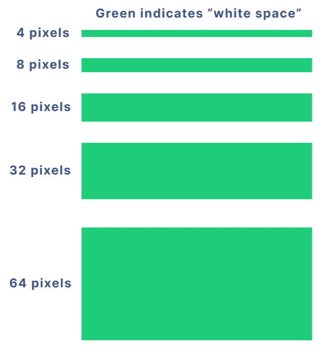
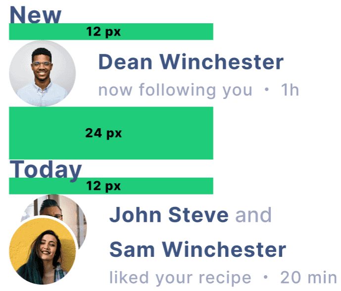
This is a common non-linear pattern many designers use. Another very common one is using 12 px and 24 px.
For example, you can use 12 px for contents under a header, but if you wish to have another header underneath, you would have 24 px of white space. This makes the distinction between contents clear to the user.
Best Practice: Don’t fear white space. Use it to break up the design and group related elements together. Consider using a non-linear spacing system. White space guides the user’s eye and helps emphasize the most important parts of your interface.
Colors
Colors can convey meaning, evoke emotions, and guide users. They can distinguish different elements, indicate interactivity, and create visual interest.
Colors are also essential components when it comes to establishing a brand.
It is important to use fewer colors strategically rather than many colors haphazardly. The use of colors can truly make or break a design.

This example implements too many colors and lacks any sort of consistency.
Instead, you want to ensure that the colors added will enhance the user’s experience rather than detract from it.

A professional UI will strategically implement a few colors for an overall better experience.
How to Select Colors
Selecting a color scheme sounds easy enough, but anyone who has tried it knows how daunting a process it can truly be.
Let me simplify it for you.
Start by selecting 1 main – or dominant – color. This color should ideally be your brand color.
Then, you will want to select some secondary and accent colors. A really easy way to do this is by using a free tool like mycolor.space.
This tool is by far my favorite as it will break down your selected color into different gradients and palettes.
Give it a try! It’s a lot of fun.
Best Practice: Use a consistent color scheme throughout your interface. Limit your palette to a dominant color and its variants. Use contrasting colors for text and background to ensure readability.
Typography
Typography involves choosing typefaces, font sizes, line spacing, and text alignment. It plays a crucial role in the readability and aesthetic appeal of the interface.
How to Select Fonts
When selecting a font, it is important to take into consideration the readability of the font. Some of the most common fonts for UI design include:
Roboto
Helvetica
Source Sans Pro
Best Practice: Stick to a limited set of typefaces and use them consistently across your interface. Make sure your font size is large enough to read comfortably on all devices. Use line spacing and text alignment that facilitate easy reading.
Images
Images can enhance the visual appeal of the interface, provide context, and guide users. They can include photos, illustrations, icons, and more.
When adding images, it’s easy to overdo it. Make sure images don’t conflict with readability, or clutter the screen.

Instead, ensure your images enhance the user’s experience and don’t get in the way.

Best Practice: Use high-quality images that are relevant to your content. Usually less is more when it comes to imagery, so use them sparingly but thoughtfully.
Buttons
Buttons are used for primary actions in your interface, such as “Submit,” “Cancel,” or “Download.” They should be easy to identify and use.
Buttons should immediately indicate to the user what their purpose is and should be designed in a way that enhances clickability.

This example does not indicate to the user that the “Category” options are clickable, and even if the user does decide to click them, they will have a hard time clicking them due to how small the buttons are.
At the bottom, although the buttons are a large enough size, they are both the same color which may confuse the user in this scenario.

On the other hand, this example clearly indicates to the user that the “Category” options are clickable and that only one option can be selected at a time.
The “Done” button at the bottom is clearly differentiated from the “Cancel” button, telling the user what each button does without having to read them.
Best Practice: Make your buttons look clickable, and always ensure the status of the button is known to the user. Use clear and concise labels. Place them where users can easily find and click them. Make them large enough so that they are easy to click.
Grids
Grids provide a framework for arranging content and maintaining alignment and consistency.
Rather than haphazardly placing UI elements on the frame, you should implement some sort of grid like this one:
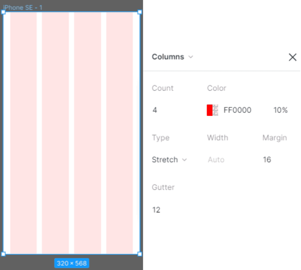
There is no one way for how your grid should look exactly. The only thing that matters is that all of the variables need to be divisible by 4.
So in this example, the column count is 4, the margin (space from the left and right of the screen till the first column) is 16, and the gutter (space between columns) is 12.
Best Practice: Use a grid system that is divisible by 4 to align elements and maintain consistent spacing. This will help create a clean and organized interface.
Shadows
Shadows, usually referred to as “drop shadows,” can add depth to your interface, making it more visually pleasing, differentiate elements, indicate interactivity, and guide users.

The “Pancake” looks far more interactable than the “Salad” here.
The light and subtle shadow gives it that “3D” effect, overall making the card stand out in a positive way.
How to Implement Shadows
By far the easiest way to implement shadows in Figma is by adding “Drop shadow” under “Effects” and changing the “Blur” to 24 and “Y” to 8 and keeping the opacity at 25%.
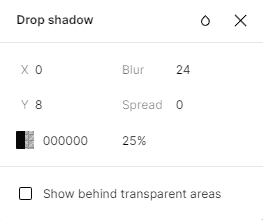
Just like grids, there is no one correct way to do this, but these variables should be a good starting point.
Obviously, feel free to experiment with what works best for your design.
Best Practice: Use subtle shadows sparingly and consistently across your interface. Ensure they align with your overall design aesthetic and enhance rather than distract from your content.
Icons
Icons are small, symbolic graphics used to represent content or actions. They are essential for an intuitive and usable interface.
The use of icons has become so prolific, that users associate certain icons with certain actions; such as a “home” icon representing the home page, a “magnifying glass” icon representing the ability to search for content, and dozens of other examples that I’m sure you are very familiar with.
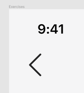
When sizing your icons, keep clickability in mind.
For example, here I have a chevron icon which is being used as a “back” button. It allows users to go back to the previous page.
The size of the icon itself is 12 x 24 px.
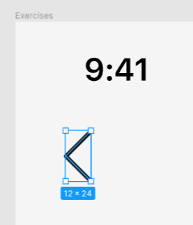
However, keeping in mind that the user will constantly interact with this icon, the icon should be incorporated in a larger frame. Here, the chevron icon is in a frame that is 32 x 32 px.
This is essential for usability and will be especially useful when you move on to prototyping your designs.
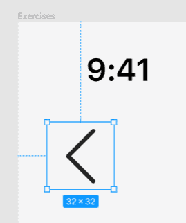
The chevron icon is still 12 x 24 px, but the clickable frame around it is 32 x 32 px.
How to Implement Icons
One simple way to incorporate icons in your design is by using the “Iconify” plugin if you are designing on Figma.
This plugin easily allows you to search for over 100,000 icons and easily add them to your Figma project.
Best of all, it’s free!
Best Practice: Use icons that are easy to understand and consistent in style. Make sure they enhance understanding rather than create confusion. All icons must be consistently sized and large enough to be easily clickable if required.
Cards
Cards are containers for content and actions about a single subject. They are a great way to organize information in a digestible and aesthetically pleasing way.
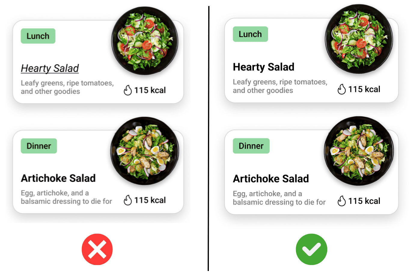
When designing cards that display similar content, staying consistent is a must. Take a look at this example showing two cards that display the same information, but differently:
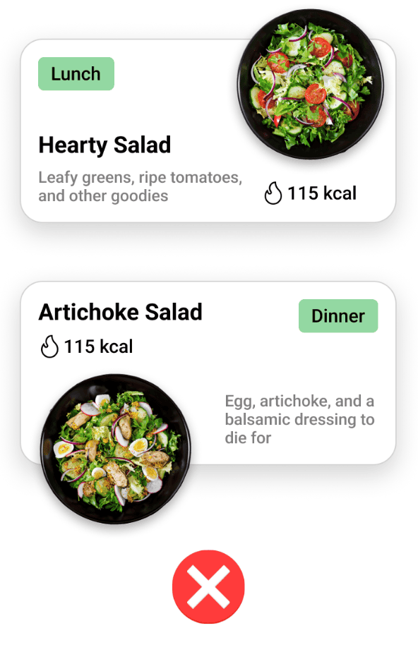
Making the user search for information is a big no-no. Instead, keep similar information in the same place.
This way, the user does not have to think about where to find certain information on the card, they know that every card will display the information in the same place.
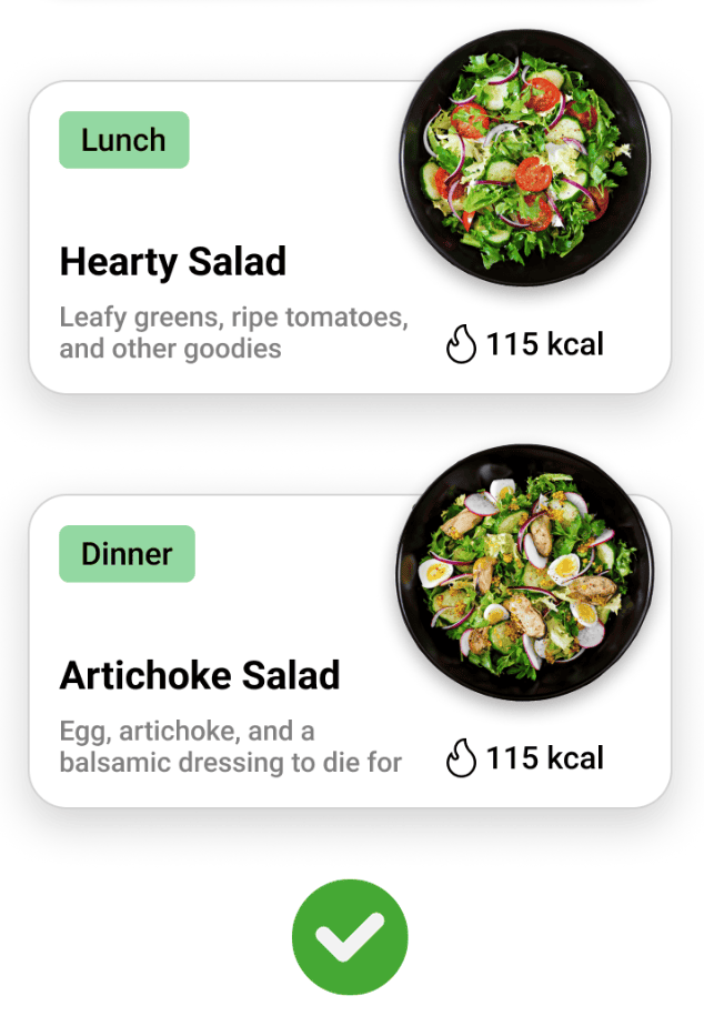
Much better. Now the user doesn’t have to search for the calorie amount or recipe name anymore. Whenever they encounter this type of card, they will be able to understand it at a glance.
Best Practice: Make sure your cards are easy to read and interact with. Use them to group related content and actions together. Cards need to be consistent when pairing similar content to avoid confusion.
Understanding and effectively implementing these design elements can significantly enhance the usability and aesthetic appeal of your UI design.
Managing UI Design Elements in Your Projects
When creating a user interface, it’s crucial to manage the UI design elements effectively. These elements form the building blocks of your interface, and how you manage them can greatly impact the usability and aesthetic appeal of your design.
Here are some strategies to help you manage these elements effectively:
Implement a Design System
A design system, sometimes referred to as a style guide, organizes all of the colors, typography, buttons, and icons in one location. By cataloging these elements, you can ensure consistency, reusability, and coherence in your design.
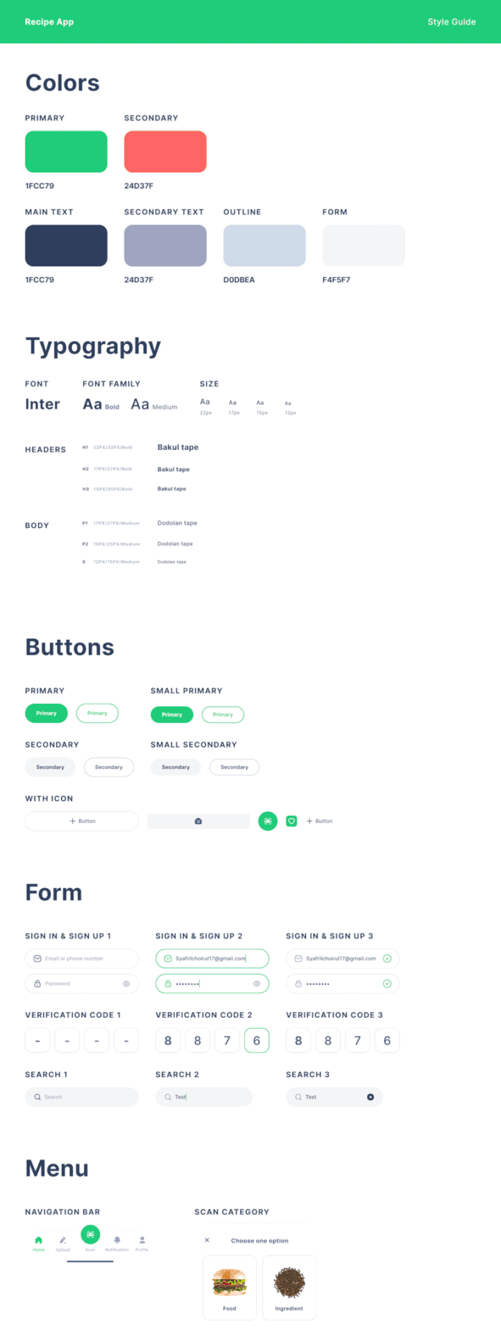
This is an example style guide for the app “Recipeo” by Bilal Asghar.
Every main element and component of the app is neatly organized in one location. This ensures the design is consistent throughout, making it easier for you and other designers to implement the design.
Analyze Existing Interfaces
Another effective strategy for managing UI design elements is to analyze existing interfaces. This can inspire you, help you identify effective design patterns, and avoid common pitfalls.
For instance, if you’re designing a music streaming app, you might want to analyze the interfaces of successful apps like Spotify or Apple Music. Look at how they use design elements like buttons, sliders, icons, and colors. What works well? What doesn’t? What can you learn from their design?
Remember, the people who designed these interfaces are experts, and often have a strong understanding of user needs. So instead of trying to reinvent the wheel, learn from what is already working.
Some excellent places to find inspiration are: Dribbble, Mobbin, and Nicely done. You could honestly spend hours just browsing, learning, and getting inspired by the seemingly endless amount of impeccable designs on these sites.
By analyzing existing interfaces, you can gain insights that can guide your own design decisions.
UI Design Principles
When it comes to creating effective user interfaces, there are several guiding principles that UI designers rely on. These principles serve as the foundation for crafting interfaces that are not only visually appealing but also user-friendly and intuitive.
Let’s delve into some of these key principles and their best practices.
Consistency
If there is anything in this article that has been repeated over and over, it is consistency.
Consistency is the key to a smooth user experience. It involves maintaining the same design patterns, color schemes, fonts, and button styles throughout the interface.
This uniformity reduces the learning curve for users, as they can apply their knowledge from one part of the interface to another.
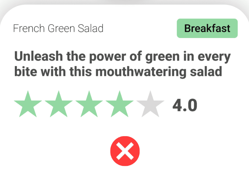
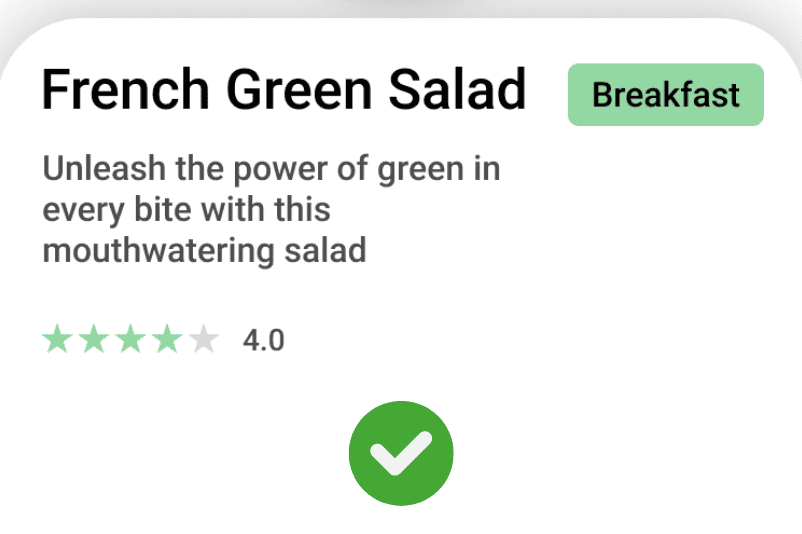
Let’s take the card example used previously.
Can you spot the difference? The text styling is different from one card to the other on the left. Whereas on the right, all text, images, and colors are similar, the way they should be.
In order to maintain consistency in your UI designs, implementing a style guide will do wonders. Rather than having to remember how every part of your design should look, you can refer to the style guide to prevent any mistakes.
In addition to improving usability, consistency also helps to establish brand identity.
Best Practice: Maintain a consistent design language across all elements and sections of the interface.
Error Prevention and Feedback
A well-designed interface should prevent errors from happening in the first place. This can be achieved through clear instructions, intuitive design, and safeguards for critical actions.
However, when errors do occur, the system should provide clear, constructive feedback. This feedback should help users understand what went wrong and how they can rectify the issue.

This is a good example of error prevention and feedback in UI design.
Here, if the user tries to select “Next” before filling out all of the necessary information, they will be prompted with red text and red text boxes.
It is important to not rely solely on the red color, as some people may have trouble viewing the color red, so be sure to include other methods of feedback such as text.

In this example, all of the information is filled out, and the button at the bottom changes color to green, indicating to the user that they have completed what needs to be done and that they can move on.
Best Practice: Provide clear instructions and implement safeguards to prevent errors. When errors occur, provide clear and constructive feedback.
Visual Hierarchy
Visual hierarchy is a principle that involves arranging elements in a way that implies importance. Larger, bolder elements are perceived as more important than smaller, subtler ones.
Let’s take a look at an example:
Here is an example of poor visual hierarchy. The eyes are immediately drawn to the description and the star rating. This isn’t what you want.
This is much better. The eyes will start from the most critical information at the top, and work their way down to cover the rest of the information.
Effective use of visual hierarchy guides the user’s eye across the page, helping them understand the flow of information and interactions.
Best Practice: Use size, color, and positioning to establish a clear visual hierarchy in your design.
Flexibility and Efficiency of Use
An effective UI design caters to both inexperienced and experienced users. It should provide shortcuts and advanced functions for experienced users, while still being intuitive and easy to use for novices.
The interface should be flexible enough to accommodate a wide range of user skills and preferences.
Best Practice: Design your interface to be flexible and efficient, catering to a wide range of user skills and preferences.
Aesthetic and Minimalist Design
A good UI design should be visually pleasing and uncluttered. Extraneous information or elements can distract users from their tasks and make the interface more complicated than necessary.

Here, the users are learning how to perform the bench press exercise. The screen looks cluttered and unprofessional.

Consider initially hiding any extra information, and if the user wants to read more, they have the option to.
By keeping the design clean and minimal, designers can help users focus on what’s important and improve overall usability.
Best Practice: Keep your design clean and minimal, removing unnecessary elements or information.
Recognition Rather Than Recall
An effective interface should make it easy for users to recognize what they can do, rather than having to recall information from memory. This can be achieved through visible options, clear instructions, and intuitive design.
Recognition-based designs reduce the cognitive load on users, making the interface easier and more enjoyable to use.
This design principle is closely tied to consistency. If your design is consistent, users will not have to recall, rather they will recognize.
Best Practice: Use visible options, consistency, clear instructions, and intuitive design to make actions and options easily recognizable.
User Control and Freedom
Users often make mistakes or change their minds during interactions. A good UI design should provide ways for users to reverse their actions or exit the current state easily.
Let’s look at an example:
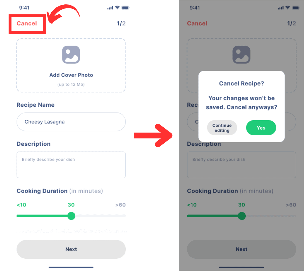
Here, the user is given the option to “cancel” adding a new recipe. If the user does click on that, they should be told that their progress will not be saved.
Of course, users can be given the option to “save as draft” among other options, this is simply one example.
Doing this gives users a sense of control and freedom, which can greatly enhance their experience.
Best Practice: Provide easy ways for users to reverse actions or exit the current state. Always inform users about any changes that will occur as a result of exiting the current state when applicable. For example, exiting when completing a form will alert the user that the inputted information will not be saved.
By keeping these principles in mind, UI designers can create interfaces that are not only visually appealing, but also intuitive, user-friendly, and effective.
Accessibility and UI Design
In the realm of UI design, accessibility stands not as an optional feature but as a fundamental requirement.
Accessibility means making your interface usable by everyone, including people with disabilities. It’s about breaking down barriers and creating an inclusive experience where everyone can participate.
Color Contrast
One critical aspect of UI design, especially from an accessibility standpoint, is color contrast. Color contrast refers to the difference in color between the font (or anything in the foreground) and its background. The higher the contrast, the easier it is to distinguish between the two.
The Web Content Accessibility Guidelines (WCAG) recommend a minimum contrast ratio of 4.5:1 for normal text and 3:1 for large text.
One excellent free plugin if you are designing on Figma is the “Contrast” plugin.
This plugin can easily analyze different contrasts in your design.
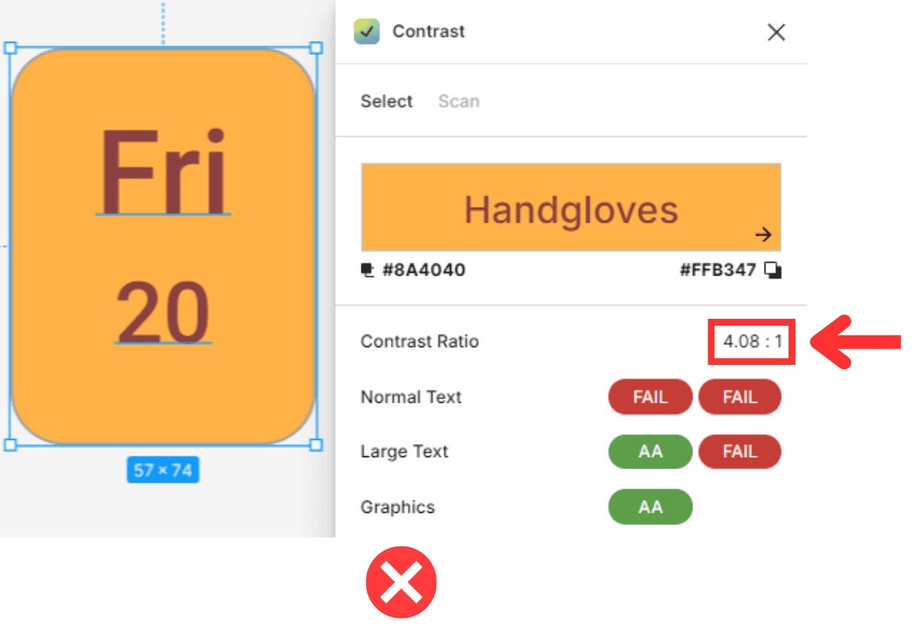
Here is an example of the contrast plugin showing that the font color doesn’t have a great enough contrast with the background.
The contrast ratio here is 4.08:1, this is a bit off of the target 4.5:1 ratio.
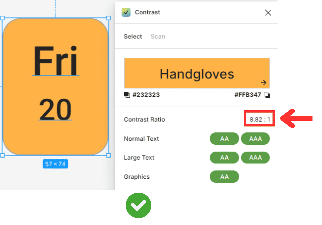
On the other hand, here is an example where the difference in contrast between foreground and background is high enough.
Here, the plugin shows us that there is an 8.82:1 ratio, well over the target 4.5:1.
Implementing Adaptive Features
Adaptive features not only make your interface more accessible, but they also make it more flexible and user-friendly. They allow users to customize the interface to their needs and preferences, enhancing their experience and satisfaction.
So, whether your user is a tech-savvy teenager or a senior citizen with poor vision, adaptive features can help them navigate your interface with ease and confidence.
Some examples of adaptive features include:
Adjustable font size and color options
High contrast mode
Keyboard shortcuts
Voice commands
Screen reader compatibility
By incorporating these adaptive features into your interface, you can enable users to access it, ensuring that it is accessible to a wide range of users.
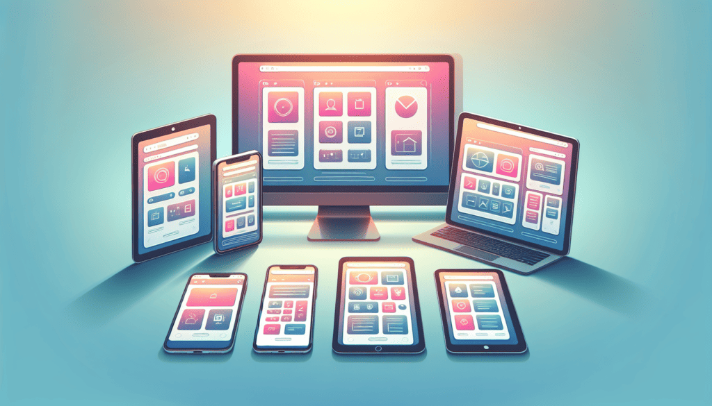
Optimizing UI for Different Devices
In the current digital age, users interact with interfaces across a variety of devices, ranging from desktop computers and laptops to tablets and smartphones. As a UI designer, it’s crucial to ensure that your interface looks good and works well on all these devices.
This is where responsive design comes in. It’s a design approach that allows your interface to adapt to different screen sizes and orientations, providing a consistent user experience across devices.
Responsive Design Best Practices
Here are some best practices for implementing responsive design:
Fluid Grids: Use fluid grids that resize and rearrange elements based on the screen size. This way, elements will adjust their width and position according to the screen size, offering a seamless experience across devices.
Flexible Images: Images should be flexible, meaning they should automatically resize to fit the screen.
Breakpoints: Use breakpoints to apply different styles for different screen sizes. Breakpoints are specific screen widths where the layout changes, ensuring the design adapts to the available screen space.
Mobile-First Approach: Start designing for smaller screens first and then gradually add more features and content for larger screens. This approach ensures your design will work on the smallest devices and can help improve performance.
Testing: Regularly test your design on different devices and screen sizes to ensure it works properly. This includes testing on real devices, not just resizing your browser window.
Avoid Fixed Widths: Avoid using fixed widths for elements as they can break the layout on different size screens. Instead, use relative widths that adjust according to the screen size.
Clear Navigation: Ensure that navigation is clear and easy to use on all devices. On smaller screens, consider using a hamburger menu or a dropdown menu to save space.
Touch-Friendly Elements: Make sure all interactive elements like buttons and links are large enough to be easily tapped on a touchscreen.
By following these practices, you can create a responsive design that provides a consistent and enjoyable user experience across all devices.
UI Design Is an Iterative Process
UI design is an ongoing journey rather than a final destination. It’s an iterative process that involves continuous improvement and refinement. The design you start with is rarely the one you end with, and that’s okay. In fact, it’s expected.
This iterative process involves creating a design, testing it, learning from the feedback, and then refining the design based on that feedback. It’s a cycle of continuous learning and improvement, where each iteration brings you closer to a design that best meets the needs of your users.
Don’t be afraid of iterations. Embrace them. They’re not a sign that your design is flawed, but rather that it’s evolving.
Remember, every great UI design you see today went through countless iterations before it became what it is. And it will continue to evolve because the process of UI design is never truly finished.
Summary
UI design is a comprehensive and iterative process that goes beyond aesthetics. It requires a deep understanding of user needs, clear design objectives, and the application of various design principles and techniques. Key elements such as visual hierarchy, consistency, adaptive features, and responsive design play crucial roles in crafting a user-friendly and engaging interface. Moreover, it’s essential to ensure accessibility for all users and optimize the design for different devices. Through continuous testing, feedback, and refinement, UI designers strive to create an interface that is not only visually pleasing but also enhances the overall user experience, making the digital journey smooth and enjoyable for all users.
Frequently Asked Questions
What are the key takeaways for successful UI design?
Successful UI design balances creativity with usability, and engages users visually while ensuring ease of navigation and functionality. It’s a user-centric process that includes clear design objectives based on target users and business goals. It involves building interactive prototypes, utilizing advanced techniques, ensuring cross-device compatibility, and refining designs based on user feedback.
What are the fundamental elements of UI design?
The fundamental elements of UI design include color, typography, white space, images, buttons, grids, shadows, icons, and cards, among others.
What are the principles of UI design?
The principles of UI design include consistency, error prevention and feedback, visual hierarchy, flexibility and efficiency of use, aesthetic and minimalist design, recognition rather than recall, and user control and freedom.
What is the difference between UI and UX design?
UI (User Interface) design is about the look of the product, and UX (User Experience) design is about the overall experience of the user. Think of it like this: UI refers to how the design looks, while UX refers to how the design works.
How do I teach myself UI design?
To teach yourself UI design, start by learning the fundamentals of design. Read articles and watch some informative videos on the subject. You might want to consider enrolling in an online course or bootcamp, as free resources can only get you so far.
What are the basic steps of UI design?
The basic steps of UI design include user research, defining objectives, wireframing, visual design, prototyping, testing and iteration, and development handoff. These steps ensure a thorough and effective design process.
What software is used to create UI?
You can use Adobe XD, Sketch, InVision, or Figma to create UI. Each of these software tools offers different features for UI/UX design.
What is the role of a UI designer?
A UI designer’s primary role is to improve the user’s experience by making the interface of websites and applications intuitive, user-friendly, and aesthetically pleasing.